Room to think, by design.
Warm paper, quiet spacing, and a little mint. The visual choices that give House its sense of calm.
Begin with what needs attention
An interface has a limited amount of attention to work with. A heading, a field, a result, and a reference cannot all be the loudest thing on the page. House uses spacing and a restrained visual hierarchy to give each element a clear place. The question is always what the reader needs to notice next.
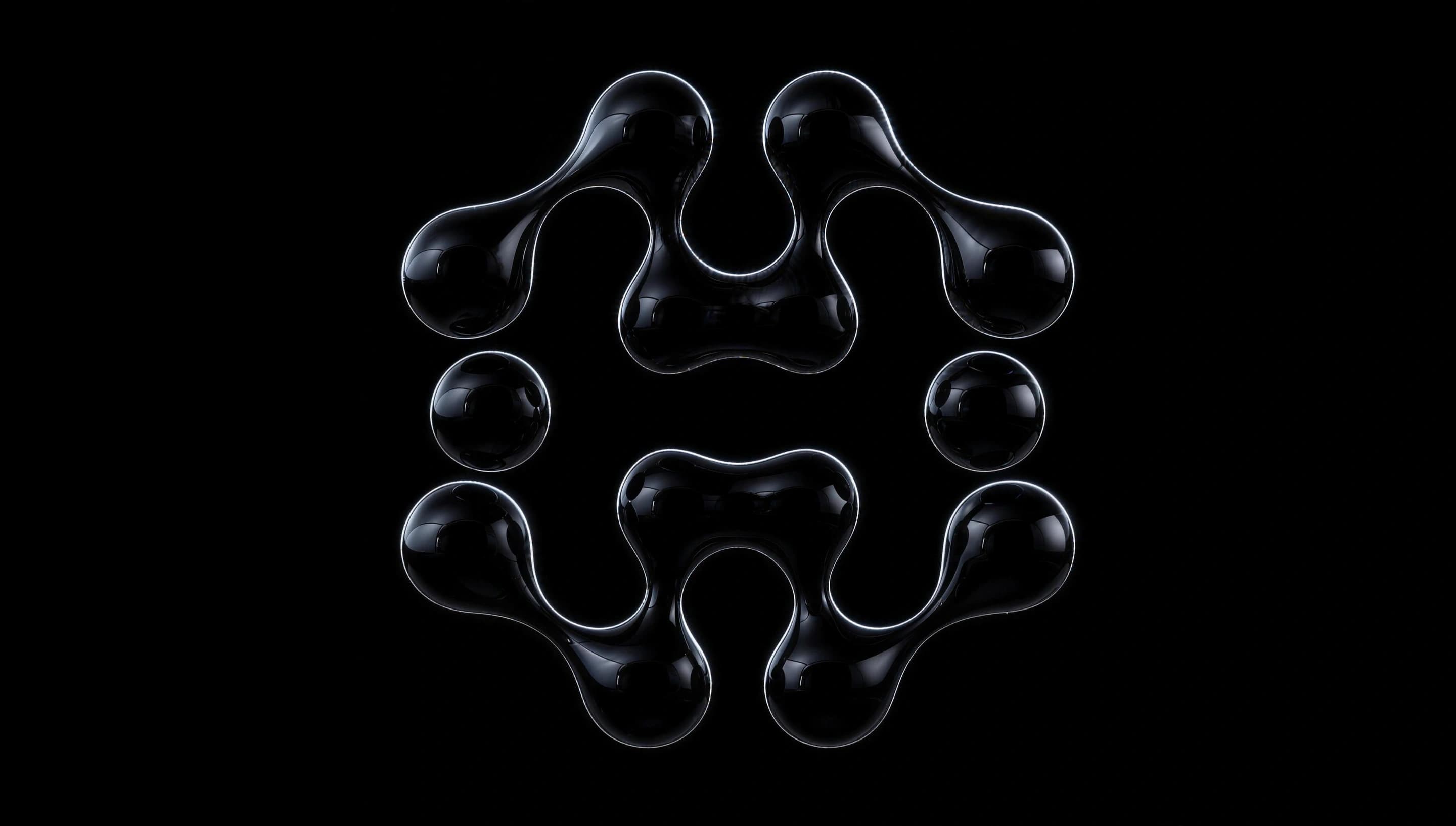
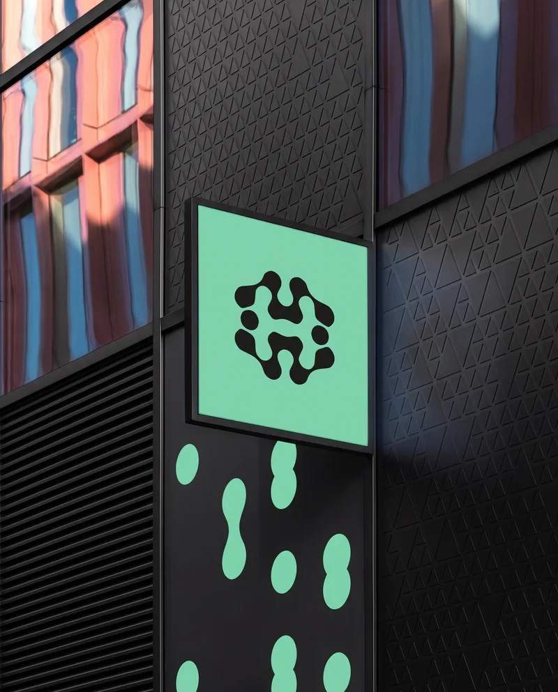
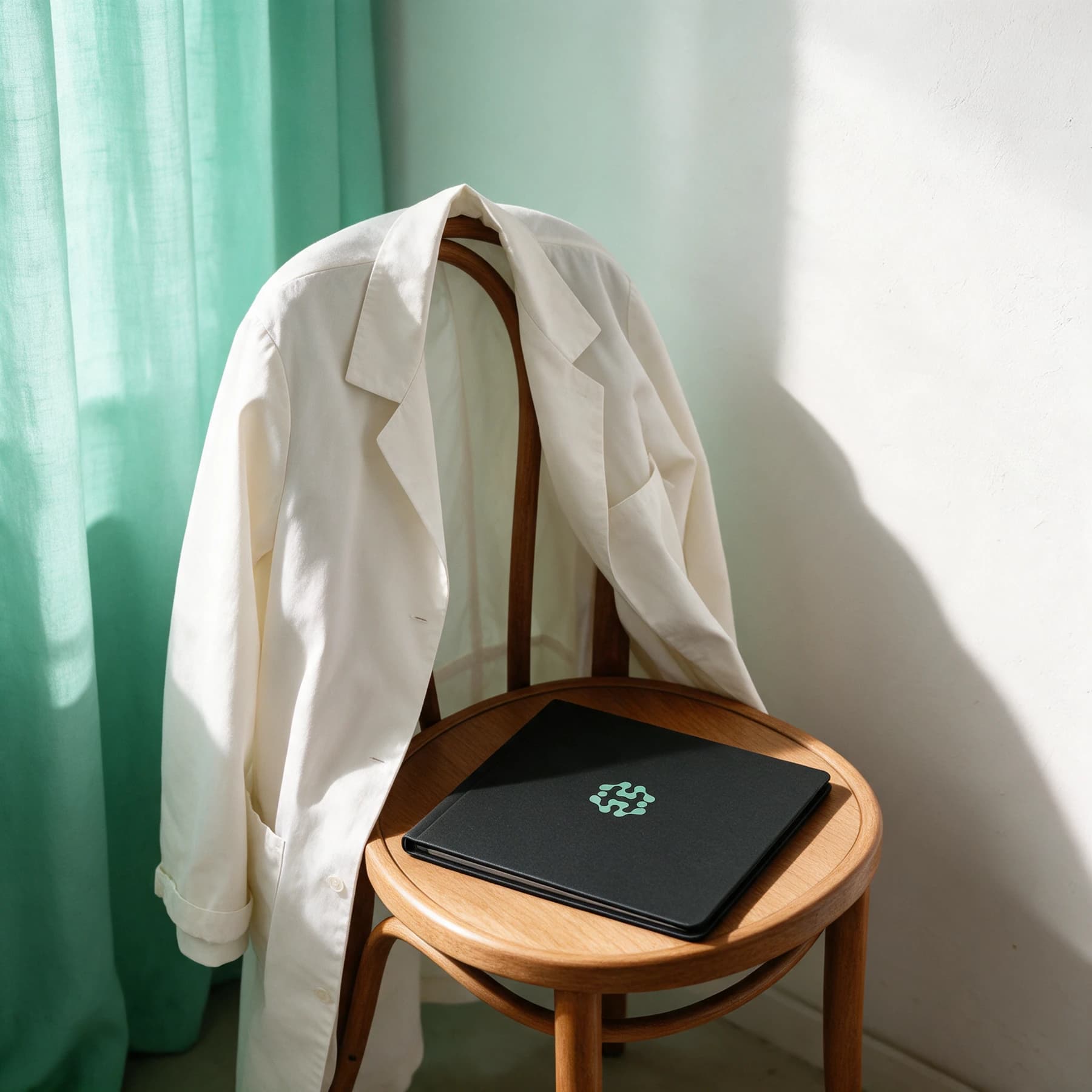
The palette starts with warm paper and charcoal. Mint appears as a recognisable accent, carrying the House mark and drawing attention to selected actions. These few colours establish a common setting across the landing page and the public toolkit, without asking every surface to compete for attention.
Make space do some of the work
Space can separate two ideas without introducing another box. A fine rule can organise a list. A change in type size can tell a reader where to begin. These small choices help House carry detailed information while keeping the surrounding structure simple. They also make room for the content to vary in length.
That approach is especially useful in a directory. The page needs to support browsing, searching, and filtering, but the entries themselves deserve the most attention. A consistent rhythm lets a reader move from one title to the next without relearning the layout at every step.
A human setting, without the noise
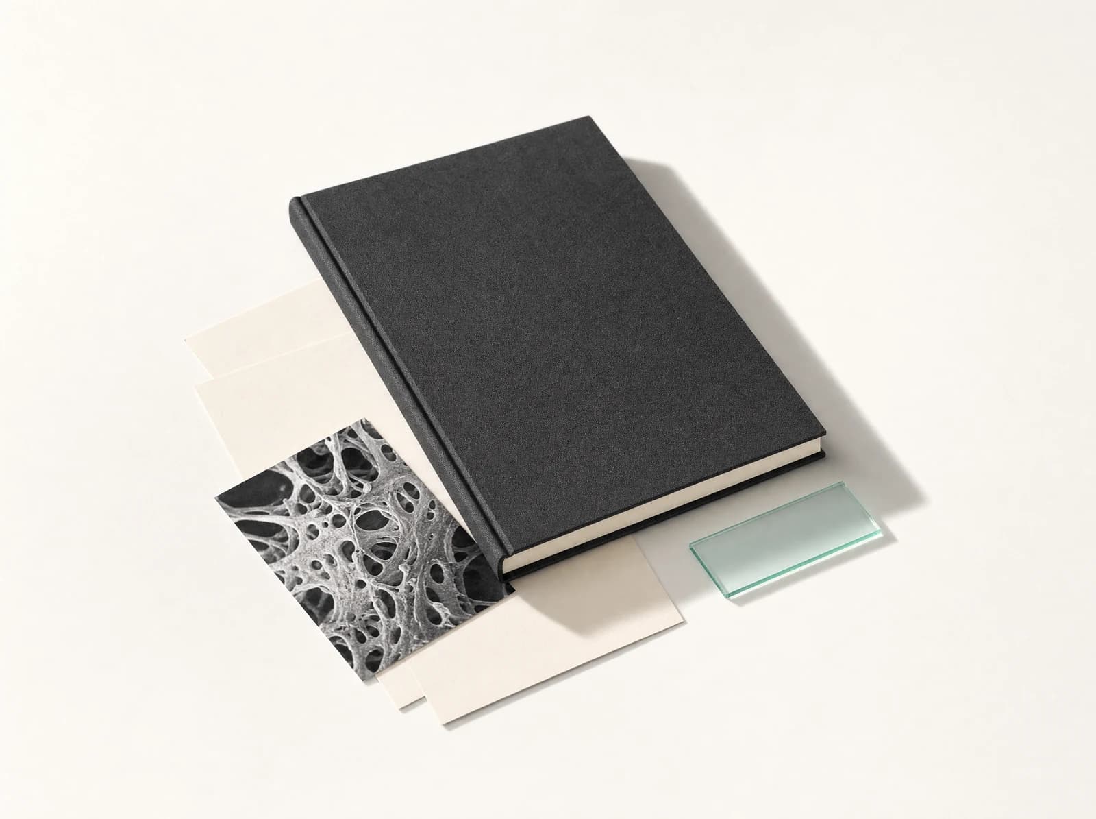
The artwork extends that atmosphere. A coat resting on a chair, a simple sign, a carefully arranged object: these images suggest a world around the product without needing to illustrate every feature. Their materials and proportions matter as much as their colour. They should feel considered, even when they are small.
On the screens where the task is the priority, the same character can come through typography, spacing, and a few clear controls. An image is only useful when it earns its space. The design ambition is a place that feels recognisably House, and gives the person using it enough room to think.